Add Your Heading Text Here
BRANDING
I was asked to create a fake brand for a school project in a group. We were tasked to develop the brands identity. For example the typography, colours, logo and everything for the brand as if it were a real brand.
LOGO
The design process focused on capturing the playful and energetic nature of the word “POP.” I explored different variations in color, form, and texture with my group to achieve a balanced and cohesive look. The final logo features a refined pink palette, rounded typography, and a dynamic splash element integrated into the “O” effectively conveying motion and vibrancy while maintaining a playful and modern aesthetic.
COLOUR PALLETE
This palette blends sweetness with sophistication, perfect for a playful yet refined gum brand.
#E292BE (Primary): A cheerful pink that feels fruity and inviting.
#7D3E62 (Text): Deep plum for clear, elegant contrast.
#EDBCD8 (Lighter Pink): Soft and airy, adds depth and warmth.
#FFF3FF (Highlight): Pale blush that brightens and refreshes the design.
Together, these colours create a cute, modern look that feels fresh and delicious.
TYPOGRAPHY
For this project, I used Super Bubble for the main title and Baloo 2 Regular for the body text. Super Bubble was chosen because its rounded, playful style fits the lighthearted and humorous tone of the comic, giving it a fun and eye-catching look that appeals to a younger audience. Baloo 2 Regular complements it with a clean, modern appearance that keeps the text easy to read while still maintaining a friendly feel. Together, the two typefaces create a balanced and engaging visual style that matches the comic’s colorful and expressive design.
PROMOTION ITEM
This comic was created as part of a group project to promote a gum brand using humor and visual exaggeration. The short story follows a character who hesitates to try the gum but ends up loving it, adding a funny and memorable twist. Our group worked together on the concept, dialogue, and overall tone to make it engaging and eye-catching. We all contributed to the idea development, scriptwriting, and layout planning. This comic was illustrated by Ashley Dupéré.
PACKAGING
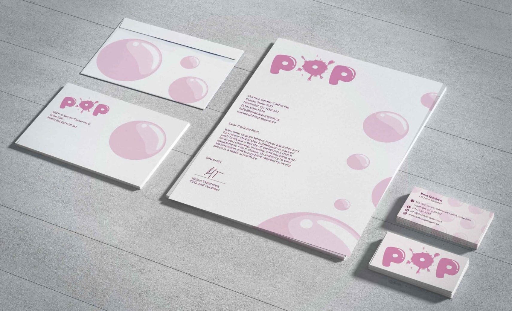
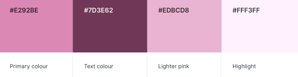
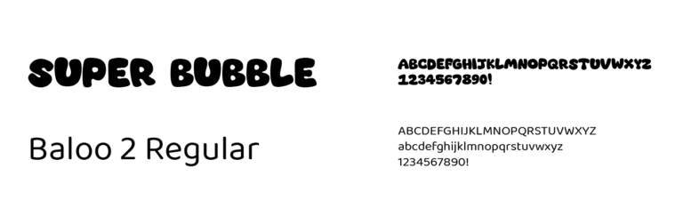
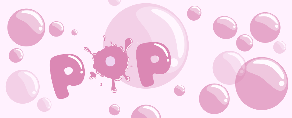
This packaging design was inspired by the playful and nostalgic feel of bubble gum. The word “POP” is central to the design, visually bursting with energy to reflect the excitement of blowing bubbles. The use of soft pink tones, rounded typography, and shiny bubble illustrations helps communicate sweetness and fun while appealing to a youthful audience.
The background filled with different-sized bubbles adds depth and movement, creating a light and airy feeling that enhances the overall theme. The glossy highlights give the impression of freshness and flavor, making the packaging eye-catching on shelves. The design aims to capture the joy of chewing gum in a simple but dynamic way.
